-From now on, I'm opening a user test for everyone.
(any picture which you can,t see clear, you can just click on the picture to view it.)
Loading page


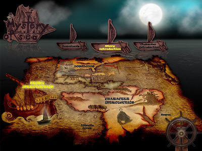
Main Page
 just imagine now you are the Captain
 you can control the sailing ship by using the ship's wheel
 find your direction and go where you want to go
So I would I like to explain a bit for this interface design. My story title is ' A mystery of sea'. As you can see and feel is most like a old type and more historical way. The thing that I want to tell you is actually a story about the ship ' Mary Celeste'. If someone hear it before...?Is actually a ghost ship story.
So for my navigation design, you can just click on any options from the small ship board that I have prepared for you or another way is you also can control the Ship's wheel to go any option you want from the map, then when you select it, the object will stand out and the option you choose will be brighter, and you can just click enter from the middle of the ship's wheel, then you can straight away go in.
-On your right hand side, there have some quetions for you.
-Hope you can answer all my questions and give me some suggestions.
(any picture which you can,t see clear, you can just click on the picture to view it.)
Loading page


Main Page
 just imagine now you are the Captain
 you can control the sailing ship by using the ship's wheel
  find your direction and go where you want to go
So I would I like to explain a bit for this interface design. My story title is ' A mystery of sea'. As you can see and feel is most like a old type and more historical way. The thing that I want to tell you is actually a story about the ship ' Mary Celeste'. If someone hear it before...?Is actually a ghost ship story.
So for my navigation design, you can just click on any options from the small ship board that I have prepared for you or another way is you also can control the Ship's wheel to go any option you want from the map, then when you select it, the object will stand out and the option you choose will be brighter, and you can just click enter from the middle of the ship's wheel, then you can straight away go in.
4 comments:
hey, give you my opinion here yah. your design very nice overall but need to guide first time user to know how to use, so mayb this can help.
1. loading page: if you got time, maybe from all black to slowly seeing more of the map.
2. for atlantic ocean and azeras maybe can put frown as well like those on top... if you put black, i might think that i can click on it.
3. consistency. if use all caps, then use all caps, if use sentence case use all the same as well. currently text on map and text on boat different. 'download' and all that.
4. when turn to yellow on the map cannot see, so maybe u need to add drop shadow.
5. wont know i can navigate the wheel, so maybe need to add blink blink arrow or i dunno what. actually i like the idea navigate from map nicer. if you make this very clear, i think dont even need to repeat it on the boat. more interesting.
6. the story introduction ship at the side make it bigger, even if it overlaps outside. i think it will be more impactful. it will make it clearer that it is a story about a ship.
7. i love the moon :)
hey, hmm i yeah i like you loading page. looks very nciely done. but i agree with chaiyen, that from start - its black then slowly lighted up ;]//
colour mood wise, it's not bad. the theme.
hmm mayeb the word alantic ocean and azeras, tyr putting it in a different colour, like borwn or so, to differentiate from the rest of navigation
hmm the tile, maybe you can bring it closwer and enlarged it? cos i didn't notice it till i looked around. and probably put a glow to it? to attrats ppl's attention ..
but overall good job!!!
hei, i vote jor lo~ thr is too much navigation i think. n at 1st i cant c thr s a boat on the map, mayb u can make it more stands out.
thr is not enuf things to c la, hope 2 c more pages~^^
but can c ur effort^^
hey TOA YOGA! XD
i'm here finally.
uhmm. your style is pretty unique. i can see there was some 3D effect on your map. you wanna to make it lk floating map on the sea right. It's quite good. I can feel that.
navi
i like your interactive navi. but how's the ship wheel control the ship on the map? confused. maybe u ignore the ship wheel or use dragging to move the ship. moreover, if u want to remain, u can put smthing stand out the ship wheel. and the color of the pop up is too yellow.
font/typo
it's quite dark. brighter abit?
loading page
i think chaiyen idea can work! blurring edges?
somemore, the sea background below there is totally black in color. what about you try deep blue? stand out the logo.
Post a Comment